How Poor App Navigation Is Costing You Conversions
You can build the most polished mobile experience in your category and still lose most of your users before they ever see its value. According to the Nielsen Norman Group, 68% of users abandon an app because of navigation issues—not bugs, not branding, not features. Navigation.
When navigation fails, everything else falls apart.
Conversions drop. Retention slips. Support load rises.
This isn’t a UX theory problem. It’s a business problem.
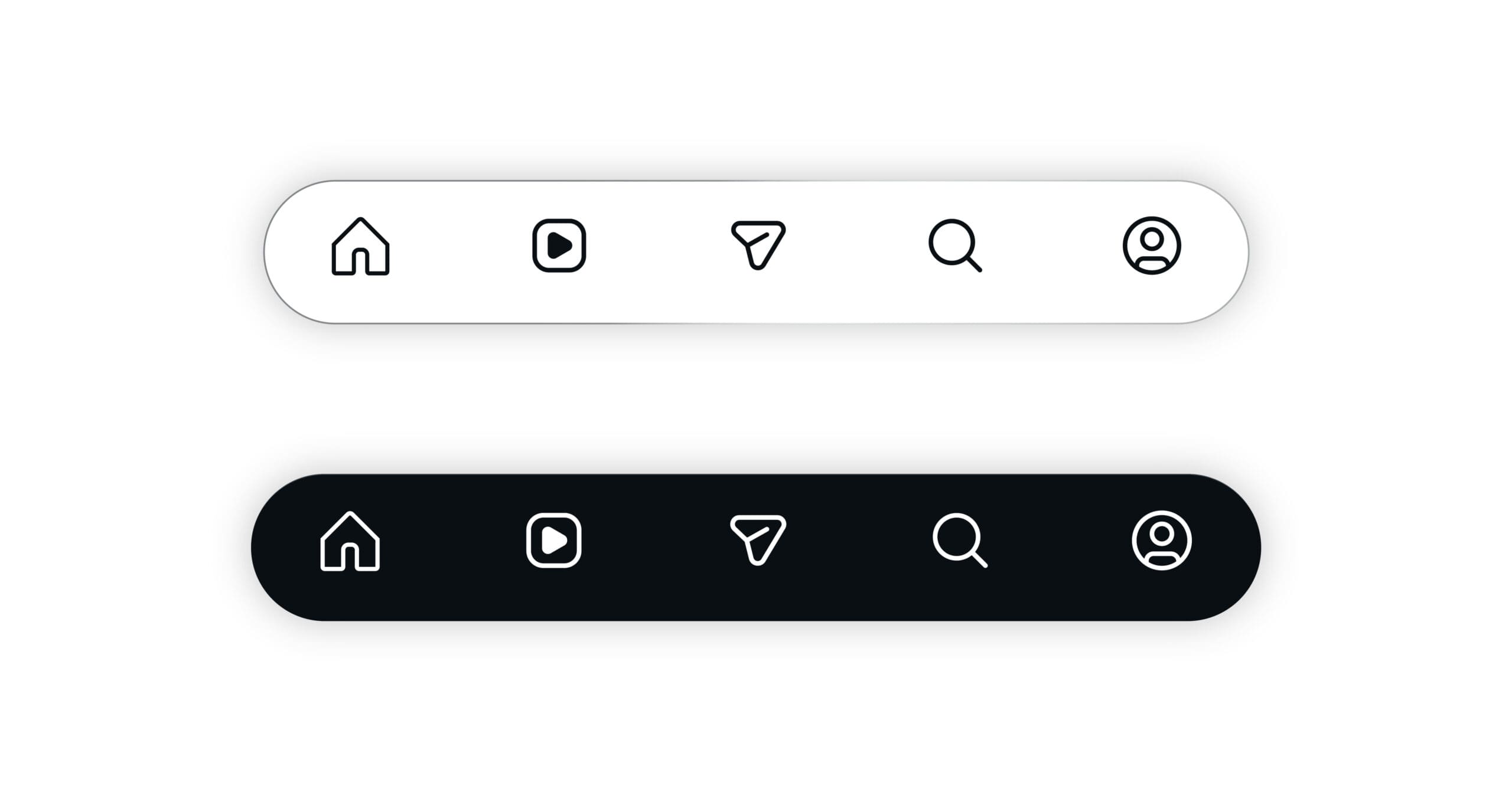
What App Navigation Actually Means
Strong navigation is not just menus and icons. It’s the system that guides people through your product—the information architecture, labeling, layout, and pathways that shape how quickly users understand the app and how easily they move through it.
Good navigation:
- Aligns with how users think
- Reduces unnecessary decisions
- Makes first actions obvious
- Helps users recover when they make mistakes
- Minimizes friction during critical tasks
Teams usually uncover navigation issues through card sorting, path analysis, heatmaps, content audits, and usability sessions. These tools reveal where users hesitate, backtrack, or quit—long before full redesigns are needed.
When navigation works, even a complex app feels intuitive. When it doesn’t, every interaction feels like work.
Why Navigation Matters for User Experience
Navigation determines the emotional tone of your entire product. Within seconds, users need to understand:
- What the app offers
- Where to begin
- How to get back if they take the wrong path
If they can’t, confusion sets in quickly.
And confused users rarely convert.
Effective navigation lowers bounce rates, clarifies calls to action, and reduces the need for support. Visual cues—icons, common patterns, bottom tabs, clear labels—act like road signs that build confidence and momentum.
Spotify is one well-known example: its bottom tab bar puts core actions within thumb reach, based on heatmap data showing where mobile users naturally gravitate.
Good navigation feels obvious. You rarely notice it. Poor navigation feels like a puzzle.
Conversions and Why Navigation Drives Them
A conversion is anything you want users to complete:
- Creating an account
- Completing onboarding
- Adding to cart
- Scheduling a demo
- Finishing checkout
- Upgrading a plan
Conversions depend on one thing: can the user find the next step without friction?
Navigation shapes:
- How quickly users reach key actions
- Whether users understand the path ahead
- How overwhelmed they feel at each step
- Whether they trust the process enough to continue
When navigation gets in the way—too many steps, inconsistent labels, poorly placed CTAs—users stall or exit entirely.
That’s why Baymard Institute research shows checkout flow friction is a top reason for cart abandonment.
How Poor Navigation Hurts Conversions
Bad navigation breaks conversions in predictable ways:
1. Users can’t find what matters
If important actions—search, checkout, upgrade—are buried, users leave instead of digging.
2. Tasks take too long
Every extra tap or unclear transition increases the chance of abandonment.
3. Load times stop momentum
On mobile especially, long waits between screens feel like dead ends.
4. Search and filters fail to help
Weak search or confusing categories amplify frustration. If users can’t find what they had in mind, they assume the app doesn’t offer it at all.
Tools like Hotjar and Crazy Egg often show users looping back and forth, tapping non-clickable elements, or repeatedly hitting the same dead ends. These are classic conversion killers.
Clear Signs Your Navigation Is Failing
Navigation issues usually show up in behavior long before anyone complains:
- High bounce or early-exit rates
- Users dropping out of onboarding or checkout flows
- Frequent support requests about simple tasks
- Mis-taps in usability tests
- Users relying heavily on search because categories don’t make sense
- Confusion over labels like “Workspace,” “Hub,” or “Dashboard”
The “five-second test” is especially revealing: if a user can’t explain what’s on a screen and what they can do next after a brief glance, the navigation hierarchy isn’t working.
Why Poor Navigation Creates Frustration and Abandonment
Frustration rarely comes from one major issue—it comes from many small ones.
Form friction
- Long forms
- Unclear errors
- Missing auto-fill
- Repeated data entry
NN/g research shows forms with high friction can cause 70% drop-off rates.
Accessibility gaps
- Tap targets too small
- Poor contrast
- Missing labels for screen readers
- Navigation placed outside the natural thumb zone
Accessibility issues don’t just hurt conversions—they exclude entire groups of users.
Lack of feedback
When taps don’t respond, screens don’t update, and the app doesn’t acknowledge user actions, people assume the product is broken.
Reducing these points of friction often leads to immediate improvements. Teams routinely see engagement jump when forms are shortened or when small UX patterns (like progress indicators and micro-interactions) are added.
The Hidden Costs Behind Poor Navigation
Navigation problems don’t stop at lost conversions. They create:
1. Higher support costs
If users can’t find basic features, they ask for help. Over time, this inflates support tickets and strains operations.
2. Expensive redesigns
Fixing poor navigation late requires:
- Reworking IA
- Reorganizing content
- Redefining flows
- Re-educating teams
This is far more costly than identifying issues early.
3. Loss of trust
When users repeatedly feel lost or surprised during tasks, they begin to question the product itself:
- “Is this reliable?”
- “Do I want to enter my payment info?”
Once trust erodes, recovery is slow and expensive.
How Navigation Issues Damage Revenue and ROI
Poor navigation impacts revenue in visible and invisible ways:
Ecommerce
- Hidden or confusing menu structures block product discovery
- Checkout friction increases cart abandonment
- Slow mobile experiences kill impulse purchases
B2B software
- Prospects fail to understand value during trials
- Teams struggle with adoption
- Sales cycles lengthen
- Customer acquisition costs rise
Optimizing navigation leads to:
- Higher trial-to-paid conversions
- Lower abandonment
- More frequent repeat usage
- Higher customer lifetime value
Even small improvements (like clearer labels, fewer steps, or a better search function) often produce outsized financial returns.
Who Is Most Affected by Poor Navigation?
Everyone feels the impact, but especially:
- Mobile-first users with limited screen space
- New users evaluating the app for the first time
- Users with disabilities who depend on predictable structure
- Busy users who will not tolerate delays or extra steps
Streaming apps, lifestyle apps, retail apps, B2B tools—navigation problems cut across industries.
How Mobile Users Experience Navigation Issues
Mobile amplifies every friction point:
- Slower network conditions
- Single-hand usage
- Smaller touch targets
- Limited space for menus or labels
Google reports that 53% of users abandon a page that takes over 3 seconds to load.
That’s why mobile-first navigation must prioritize:
- Bottom navigation for thumb reach
- Large, forgiving tap targets
- Optimized load speed
- Minimal, clear paths per task
Apps that design for mobile ergonomics consistently see higher engagement.
How to Identify Navigation Problems
A clean diagnostic process includes:
1. Content & navigation audit
Map screens. Identify duplicates. Surface dead ends.
2. Behavior analytics
Check funnel drop-offs, bounce rates, and path patterns.
3. Heatmaps & recordings
See where users click, hesitate, or attempt impossible actions.
4. User testing
Validate if real users understand labels and next steps.
5. Card sorting & tree testing
Let users organize content and test whether your structure makes sense.
Data from these methods points directly to the most urgent fixes.
Best Practices to Improve Navigation
Clear improvements come from:
- Simplifying menus and reducing layers
- Prioritizing critical user tasks
- Using clear, user-centered labels
- Designing for mobile-first ergonomics
- Adding visual hierarchy
- Supporting actions with clear feedback
- Testing versions through A/B testing
- Refining continuously, not once
Navigation isn’t a set-and-forget component—it’s a living system.
Measuring Success
Track:
- Time to task completion
- Funnel progression
- Drop-off rates
- First-click accuracy
- Session duration on key flows
- Support ticket trends
Analytics tools like Google Analytics and Hotjar provide the quantitative side, while usability tests reveal the qualitative side.
Navigation is successful when:
- Users find what they need instantly
- Tasks take fewer steps
- Engagement increases
- Conversions rise
- Support load drops
Final Thought
Navigation is the silent driver behind every conversion.
Users rarely notice when it’s good—but they always feel it when it’s not.
If finding a product, feature, or next step feels confusing, people won’t push through. They’ll exit, uninstall, or switch to a competitor with clearer pathways.
Good navigation doesn’t just improve UX.
It protects revenue, enhances trust, and makes every conversion easier.