How Design Can Make a Legitimate Business Look Questionable
A legitimate business can lose trust in five seconds.
In many cases, the problem has nothing to do with the product or service.
Instead, it comes down to what the design quietly signals.
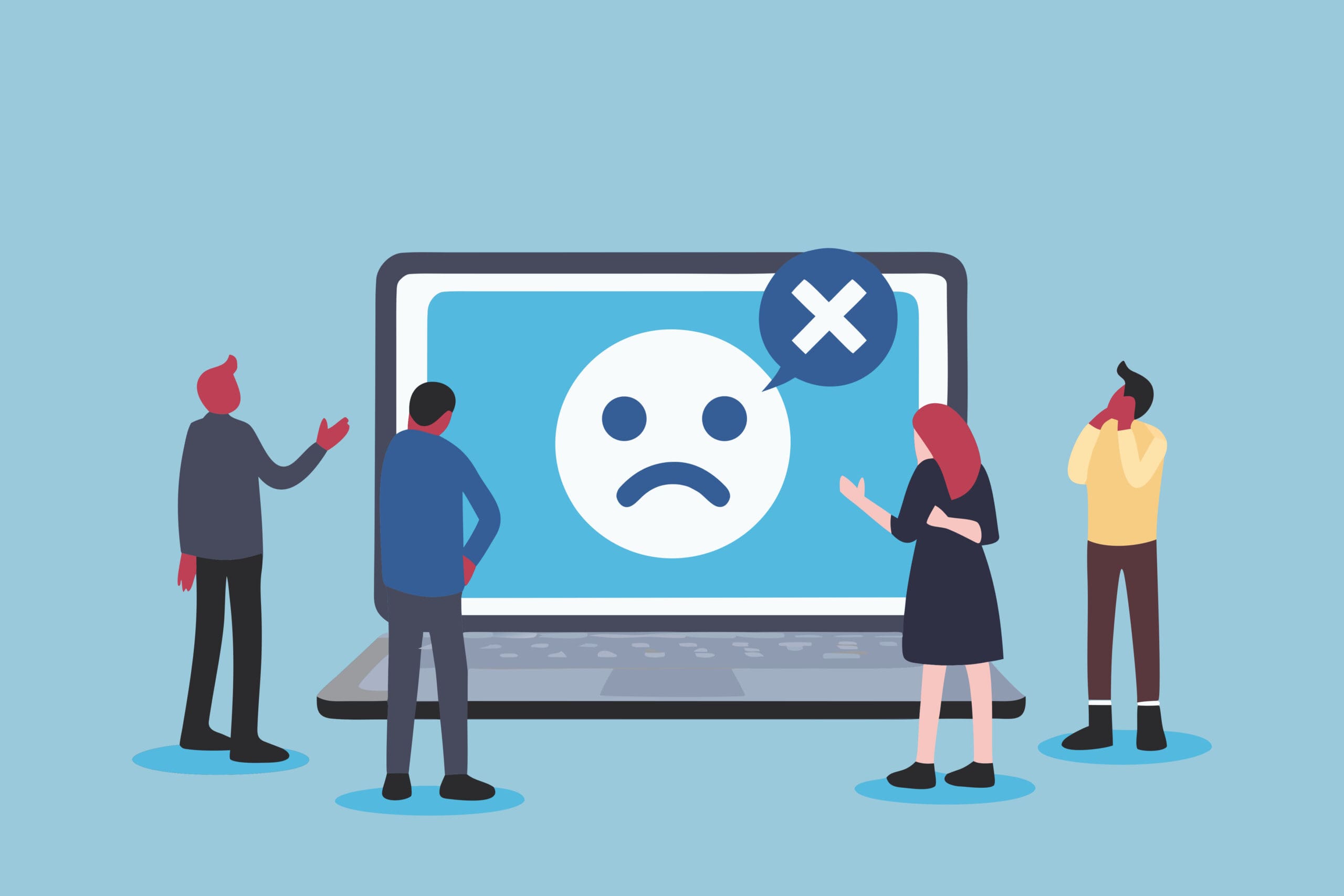
At first glance, a financial advisor’s site may appear polished. After a moment, though, cracks show. Neon accents. A blurry hero image. Three competing fonts. A menu that shifts on mobile. Nothing is technically broken, yet the same question surfaces—the one people ask on scam sites:
Is this real?
That reaction is predictable. Research on usability consistently shows that people form credibility judgments almost instantly from visual cues. As a result, when a site feels careless, users assume the business behind it is careless too.
Ultimately, this is not about taste. It is about perceived risk.
What “Questionable” Design Really Looks Like
Questionable design is rarely about being ugly. More often, it shows up as inconsistent, confusing, or oddly intense in ways that do not match the promise a business is making.
Typically, the warning signs include:
- visuals that clash with industry expectations
- text that feels improvised or difficult to read
- layouts that appear unfinished
- mobile experiences that feel ignored
On their own, these issues may seem minor.
However, once they repeat, users notice the pattern.
And patterns create doubt.
The Trust Red Flags Users Notice First
Color that feels risky
Color triggers emotion before logic ever gets involved.
When banks, law firms, medical providers, or financial advisors rely on harsh contrasts or highlighter-bright colors, the effect often feels unstable. Rather than signaling confidence, those palettes introduce tension. Even with a strong offer, the colors communicate something else entirely.
To correct this:
- begin with a restrained base palette that fits the category
- use brighter colors as accents, not foundations
- test contrast in real-world conditions, not only on a designer’s screen
If the first reaction is “this feels loud,” trust has already slipped.
Typography that looks careless
Font choices quietly communicate seriousness.
At the same time, novelty fonts, tight spacing, or excessive all-caps do more than look bad—they suggest a lack of care. That impression closely mirrors how people interpret questionable businesses.
Common issues include:
- mixing too many fonts
- using decorative fonts for body copy
- setting text too small for mobile
- running long lines without spacing
Instead:
- limit pages to one primary typeface family
- increase line height and breathing room
- test readability on an actual phone
Once reading becomes work, trust fades quickly.
Imagery that feels fake
Low-quality imagery is one of the fastest ways to trigger suspicion.
Blurry photos, awkward stock images, mismatched lighting, and stretched graphics make a site feel assembled rather than built. Even when users cannot explain why, discomfort sets in immediately.
To fix this:
- replace generic stock with real photos or simple custom visuals
- remove low-resolution hero images
- maintain a consistent visual style throughout
If visuals look like placeholders, users assume the business is too.
Layouts that look unfinished
Clutter does more than frustrate users. It undermines credibility.
When too many elements compete for attention, visitors struggle to identify what matters. Unfortunately, scam sites often rely on the same approach—crowded pages, aggressive banners, and confusing navigation.
Because of that overlap, legitimate businesses sometimes resemble patterns users already avoid.
To correct this:
- simplify hierarchy so one action is clear
- reduce competing calls to action
- add breathing room between sections
- remove anything that does not support a decision
A clean layout signals intention. That intention builds trust.
The Mobile Test Most Legitimate Businesses Fail
Today, users rarely judge a site on a desktop. More often, they encounter it on a phone while distracted.
When a site:
- loads slowly
- forces pinching and zooming
- uses tiny buttons
- shifts the layout while scrolling
…it does not feel slightly off. Instead, it feels broken.
And broken feels unsafe.
To improve this:
- test on real devices, not just simulators
- compress images and remove unnecessary scripts
- enlarge tap targets for real thumbs
- keep navigation predictable
Mobile is no longer secondary. It is the primary experience.
Inconsistent Branding Creates Instant Doubt
Users may not consciously track brand consistency. Still, they notice when something does not match.
If logos shift, colors change, or social profiles feel disconnected from the website, suspicion creeps in. At that point, users tend to assume disorganization or misrepresentation.
Neither builds confidence.
To prevent this:
- standardize logo usage, colors, and typography
- align social profiles with the website visually and tonally
- keep contact details consistent everywhere
Consistency makes legitimate businesses feel real.
Design Mistakes That Mimic Scam Patterns
This is where well-meaning businesses get hurt most. They accidentally resemble patterns users already associate with fraud.
Pay close attention to:
- “as seen on” logos that do not link anywhere
- constant urgency banners or countdown timers
- pop-ups that appear immediately
- vague claims without specifics
- missing ownership or contact information
Although some of these tactics boost short-term conversions, they also train users to distrust you.
When design feels like pressure, risk is assumed.
What to Fix First (Without Wasting Time)
Rather than starting with a full redesign, begin with a trust audit.
In most cases, this order delivers the fastest gains:
- Mobile usability
Without a usable mobile experience, everything else fails. - Typography and spacing
If reading feels difficult, trust never forms. - Visual consistency
Fragmented branding creates hesitation. - Image quality
Fake visuals create fake impressions. - Page hierarchy
When the next step is unclear, users assume disorder.
None of this requires trend-chasing. It requires restraint.
The Real Bottom Line
People do not separate a business from its design.
When a site feels careless, the service feels careless.
If visuals feel improvised, so do policies.
Once layouts feel chaotic, operations feel chaotic too.
Even legitimate businesses can look questionable.
Fortunately, trust signals are fixable—not through trends, but through clarity, consistency, and intention.