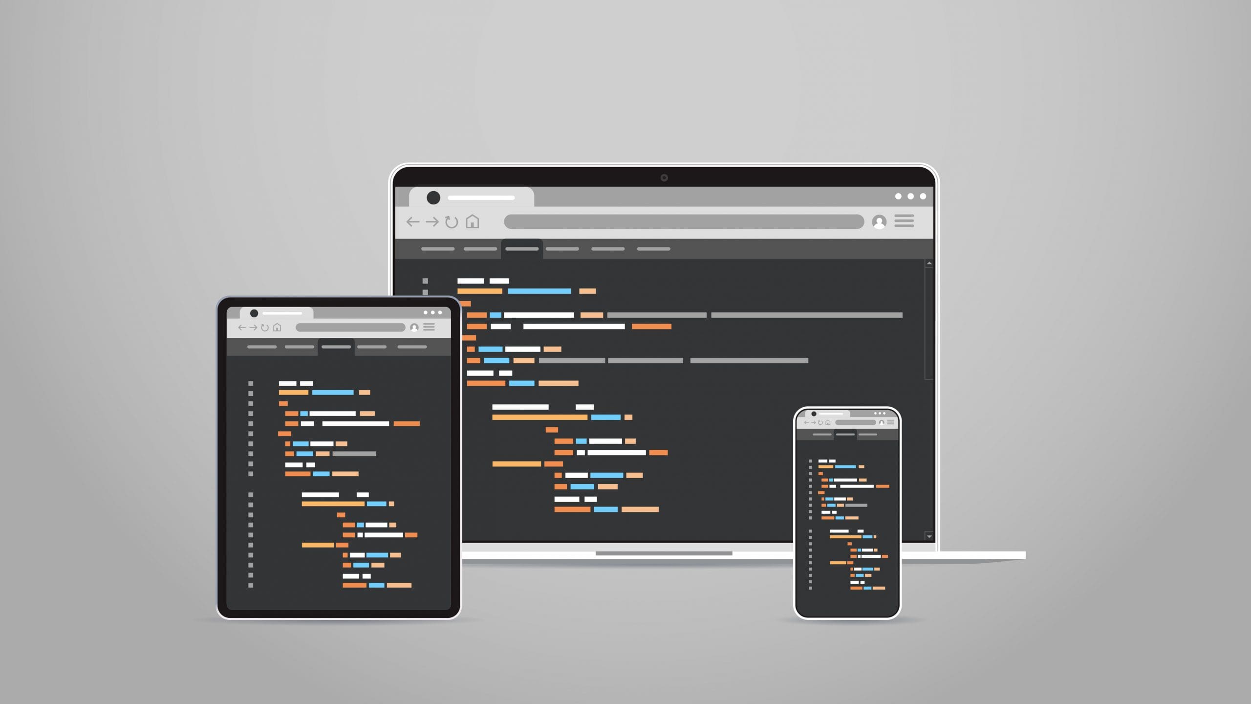
Cross-Platform Web Design Strategies
Cross-platform web design is a critical component in modern web development, addressing the need for websites to function seamlessly across a variety of devices, including desktops, laptops, tablets, and smartphones. This approach is increasingly important in a world where mobile device usage is surging, enabling businesses to cater to a broader audience. By ensuring compatibility and a consistent user experience across all platforms, cross-platform web design not only enhances customer satisfaction but also offers cost-effective solutions for businesses. It stands as a cornerstone in developing a versatile and accessible online presence in today’s digitally diverse environment.
What is Cross-Platform Web Design?
Cross-platform web design is the process of creating websites or web applications that can operate smoothly on multiple operating systems and devices. This involves designing a single version of a website that can effectively adapt to the unique features of different platforms, including desktops, tablets, and mobile devices. By using this approach, users can have a consistent and accessible experience, regardless of the device or operating system they are using.
Why is Cross-Platform Web Design Important?
To effectively reach a wider audience, businesses must understand their target demographic’s preferences, employ social media and SEO strategies, create multilingual content, and ensure their website is compatible across various devices and browsers. A consistent user experience is also vital, achieved through uniform design elements like color schemes and typography, a responsive layout, and regular usability testing to maintain uniformity across all platforms. Moreover, cost-effectiveness is key, attainable through investing in responsive design to avoid the need for separate platform-specific versions, using scalable vector graphics for adaptability, and implementing an adaptive design. This approach to web design, prioritizing both reach and efficiency, is increasingly important in the digital age, allowing businesses to effectively connect with a diverse online audience while managing resources efficiently.
What Are the Key Elements of Cross-Platform Web Design?
When it comes to designing for the web, it’s important to consider how your website will appear on different devices and platforms. This is where cross-platform web design comes into play.
1. Responsive Design
Implementing responsive design starts with researching user behavior across devices, followed by creating a layout that adapts to different screen sizes. It’s essential to optimize images and media for fast loading and use CSS media queries for styling specific to device characteristics. Thorough testing on various devices is crucial to ensure a seamless experience. Prioritizing mobile design and maintaining consistency across all platforms is vital for a cohesive and functional cross-platform user experience.
2. Scalable Vector Graphics
Scalable Vector Graphics (SVG) use XML to create 2D graphics, making them easily scalable without compromising quality. This makes them a great option for cross-platform web design, ensuring consistent visuals on different devices and screen sizes. Additionally, SVG supports interactivity and animation, making it a perfect choice for creating responsive and engaging web designs.
3. Adaptive Design
- Understand User Behavior: Analyze user interaction across devices to create a design that adapts to different screen sizes and orientations.
- Flexible Layouts: Utilize fluid grids and flexible images to ensure the layout adjusts seamlessly to various screen dimensions.
- CSS Media Queries: Implement media queries to apply different styles based on the device’s characteristics, ensuring an optimal viewing experience.
When implementing adaptive design, it is important to prioritize user experience, conduct thorough testing, and stay updated with evolving technology trends.
What Are the Best Practices for Cross-Platform Web Design?
In today’s digital landscape, having a website that is optimized for multiple devices is crucial for reaching a wider audience.
1. Prioritize Mobile Design
- Conduct thorough research to understand mobile user behavior and preferences.
- Design with a mobile-first approach, prioritizing the seamless functionality and visual appeal on mobile devices.
- Optimize content and features for mobile usability and performance.
2. Use a Grid System
- Evaluate your content and determine the best-suited grid system for your website, such as the 12-column grid, to provide flexibility.
- Implement the chosen grid system using CSS frameworks like Bootstrap or Foundation to streamline the design process.
- Ensure grid consistency across platforms for a cohesive user experience, utilizing media queries for responsive layouts.
3. Optimize Images and Media
- Compress images and videos to reduce file sizes without sacrificing quality.
- Implement lazy loading to prioritize loading visible content first, enhancing user experience.
- Utilize responsive design to ensure images and media adapt seamlessly to different screen sizes.
Consider utilizing next-gen image formats like WebP for enhanced compression and quality.
4. Keep Navigation Simple
4. Keep Navigation Simple
- Limit menu items to essential sections for easy navigation.
- Use clear and concise labels for menu items and buttons.
- Implement a search feature for quick access to specific content.
- Ensure consistent navigation placement across platforms for familiarity.
What Are the Challenges of Cross-Platform Web Design?
As the use of multiple devices and platforms continues to grow, web design has become a complex and challenging task.
1. Compatibility Issues
- Conduct thorough testing across various devices and browsers to identify and address compatibility issues.
- Utilize feature detection and progressive enhancement techniques to mitigate compatibility problems.
- Stay updated with the latest web standards and technologies to ensure cross-platform compatibility.
2. Maintaining Consistency Across Platforms
- Establish style guidelines for colors, fonts, and layout to ensure uniformity.
- Utilize a centralized content management system to maintain consistent content across platforms.
- Regularly conduct cross-platform testing to identify and address discrepancies.
3. Limited Design Flexibility
- Embrace modular design: Break down complex layouts into smaller, reusable components to maintain consistency across platforms.
- Utilize feature detection: Implement code that identifies device capabilities to deliver tailored experiences without compromising design integrity.
- Flexible grid systems: Employ fluid grids and relative units to ensure content adapts seamlessly to various screen sizes, preserving design aesthetics while still allowing for limited design flexibility.
How to Implement Cross-Platform Web Design?
In today’s digital age, having a website that is optimized for all platforms is crucial for success. But how exactly do you implement cross-platform web design?
1. Research and Understand Your Target Audience
- Analyze the demographics, behaviors, and preferences of your target audience to gain valuable insights into their needs and expectations.
- Utilize tools like Google Analytics and social media analytics to gather data on user interactions and engagement.
- Create user personas based on the collected data to gain a deeper understanding of your audience’s motivations and decision-making processes.
- Conduct surveys, interviews, and focus groups to directly interact with your target audience and gather qualitative information.
2. Use a Mobile-First Approach
- Understand user behavior: Analyze how your target audience interacts with your website on mobile devices.
- Content prioritization: Highlight essential content and features for the mobile version, ensuring easy access and functionality.
- Responsive design: Develop a layout that adjusts to various screen sizes, providing an optimal viewing experience.
3. Test and Optimize Your Design
- Conduct usability testing across various devices and platforms to ensure consistent performance.
- Optimize website speed by compressing images, leveraging browser caching, and minimizing HTTP requests.
- Implement A/B testing to compare different design elements and identify the most effective ones.
Consistently testing and optimizing your design is crucial for delivering a seamless cross-platform user experience.