Best Practices for Dark Mode in Web Design
Step into the dark side of web design! Are you tired of squinting at bright screens all day long? With the increasing popularity of dark mode, web designers need to understand the best practices for implementing it. This article will guide you through the dos and don’ts of dark mode, ensuring a seamless user experience.
What is Dark Mode in Web Design?
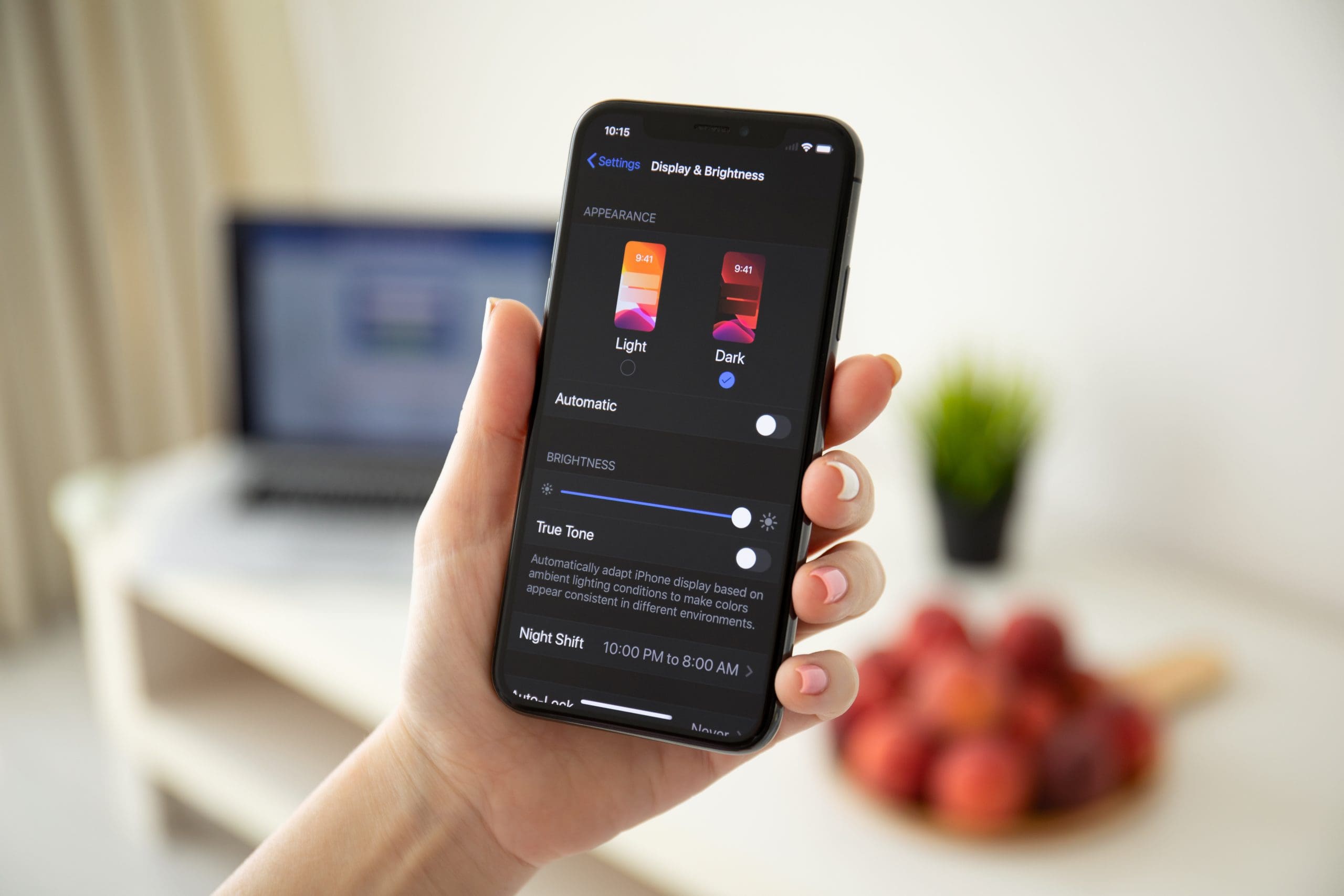
Dark mode in web design is a color scheme where the background is predominantly dark. This design choice aims to reduce eye strain, save energy on OLED screens, and create a sleek, modern look. It has become especially popular in apps and websites used in low-light environments. When implementing dark mode, it is important to carefully consider contrast, legibility, and user preference to ensure a seamless visual experience.
If you are considering incorporating dark mode into your web design, be sure to test for readability, offer users the option to switch between light and dark modes, and consider the potential impact on branding colors.
Why is Dark Mode Gaining Popularity?
In recent years, there has been a rise in the popularity of dark mode in web design. This sleek and modern color scheme has been embraced by users and designers alike for its various benefits.
1. Aesthetics and Trendiness
- Incorporate high-quality images and graphics to elevate the visual appeal of the website.
- Select a color scheme that complements the brand’s identity and resonates with current design trends.
- Employ sleek and modern design elements to create a visually striking interface for dark mode.
- Consider user experience by ensuring that the dark mode design aligns with the overall aesthetics and trendiness of the website.
The growing popularity of dark mode in web design can be attributed to its sleek and modern aesthetic, aligning with the ever-changing trends in the digital landscape. This approach not only adds sophistication but also reflects the evolving design preferences of users and designers alike.
2. Reduced Eye Strain
- Adjust Brightness: Dim the screen to reduce eye strain, especially in low-light settings.
- Use Blue Light Filters: Implement software or apps that can reduce blue light emission to help alleviate eye strain.
- Take Regular Breaks: Follow the 20-20-20 rule, taking a 20-second break every 20 minutes and looking at something 20 feet away to relax the eyes and reduce strain.
3. Improved Battery Life
- Optimize screen elements: Dark mode reduces the energy consumption of devices with OLED or AMOLED screens, resulting in improved battery life.
- Reduce screen brightness: Dark backgrounds require less power than bright ones, contributing to extended battery longevity.
- Minimize white space: Utilize dark themes to decrease the display’s power requirements, enhancing battery performance and ultimately resulting in improved battery life.
How to Implement Dark Mode in Web Design?
As the popularity of dark mode in web design continues to rise, designers need to understand the best practices for implementing this feature.
1. Use CSS Variables
- Define CSS variables for color schemes, text sizes, and other design elements.
- Utilize CSS variables to create a consistent and easily modifiable dark mode.
- Implement CSS variables for quick adjustments and seamless maintenance.
Fact: By utilizing CSS variables, design flexibility is enhanced and the process of implementing dark mode in web design is streamlined.
2. Provide a Toggle Button
- Include a toggle button in a prominent location within the website or app interface.
- Make sure the button’s design matches the overall aesthetic and is easily identifiable.
- Incorporate functionality that smoothly transitions between light and dark modes when the button is clicked.
3. Consider User Preferences
- Offer customizable settings for dark mode, such as toggle switches or automatic activation based on device settings.
- Provide options for adjusting contrast, font size, and other visual elements to accommodate diverse user needs.
- Conduct user research to understand specific preferences and integrate feedback into the design of dark mode.
A major tech company improved user experience by implementing customizable dark mode settings, leading to a surge of positive user feedback and increased app usage.
What are the Best Practices for Dark Mode?
As dark mode gains popularity in web design, designers need to understand the best practices for implementing it effectively.
1. Use High Contrast Colors
- Choose colors with a stark contrast to improve readability and usability.
- Consider using dark backgrounds with light text or vice versa for a sharp contrast.
- Ensure that all elements, including text, images, and interactive components, maintain clear differentiation.
2. Maintain Consistency
- Use consistent color schemes and design elements throughout the website.
- Ensure that the dark mode version maintains the same layout and functionality as the light mode.
- Test the dark mode across various devices and screen sizes to guarantee a consistent user experience.
Consistency is key in implementing dark mode, as it promotes familiarity and usability for website visitors.
3. Consider Accessibility
- Ensure text and graphical content maintain high contrast for readability.
- Provide alternative text for images and descriptive link text for screen readers.
- Consider user interface elements for easy navigation and interaction, such as larger clickable areas for touchscreens.
4. Test and Optimize Performance
- Conduct performance tests using tools like Lighthouse to analyze loading speed, resource consumption, and user experience.
- Optimize performance by compressing images, reducing HTTP requests, and utilizing lazy loading for non-essential content.
- Ensure smooth transitions and animations, maintaining high performance and responsiveness.
Did you know? Optimizing performance in dark mode can lead to a 15-20% reduction in battery consumption for OLED screens.
What are the Potential Challenges of Dark Mode?
While dark mode has become a popular trend in web design, it’s not without its challenges.
1. Limited Color Choices
- Take into account the brand’s color palette and select shades that are suitable for dark mode.
- Choose colors that improve readability and maintain visual appeal in environments with low lighting.
- Experiment with different color combinations to ensure they effectively convey the intended visual hierarchy and maintain clarity.
- Consider user feedback and conduct usability testing to gather insights on color preferences and readability.
When implementing dark mode, it is important to carefully choose colors that align with the brand’s identity while also ensuring optimal visibility and readability for users in various environments with limited color choices.
2. Compatibility Issues
- Varying Browser Support: Different browsers may interpret CSS properties differently, causing design inconsistencies.
- Device Compatibility: Dark mode may not display uniformly across various devices, leading to a disjointed user experience.
- Accessibility Tools: Some screen readers and accessibility features may not function optimally in dark mode, affecting user inclusivity.
To address compatibility issues, conduct thorough cross-browser and cross-device testing to ensure a seamless dark mode experience for all users.
3. Design Inconsistencies
- Conduct thorough testing across various devices and browsers to ensure consistent appearance and address any discrepancies in the design elements, such as text size, color contrast, and button styles.
- Utilize responsive design principles to maintain visual coherence across different screen sizes and resolutions and avoid any design inconsistencies.
4. Accessibility Concerns
- Ensure text is readable by using sufficient color contrast and avoiding small fonts.
- Implement keyboard navigation for users who rely on it, allowing seamless interaction.
- Provide alternative text for images to assist visually impaired users in understanding content.
- Offer customizable settings for users to adjust contrast and text size based on their needs.