The Role of Typography: Making Words Visually Appealing
Typography is a vital design aspect, shaping how text appears and communicates. It involves selecting fonts, layouts, spacing, and alignment to create harmony between text and visuals. Choosing the right typography elements impacts the message’s perception. Designers can create visually appealing and readable content by selecting fonts wisely, considering size and hierarchy, and using colors effectively. Legibility and readability are crucial, influenced by font choice and formatting like line spacing. Typography trends continuously evolve, from modern and minimalist styles to experimental layouts, influencing user experience in digital design.
The Role of Typography in Design
Typography in Design plays a crucial role in design by enhancing visual appeal, legibility, and communication. It sets the tone, guides the reader’s eye, and conveys meaning. The choice of fonts, sizes, spacing, and alignment must be carefully considered to ensure the effectiveness and aesthetic appeal of the design.
What is Typography?
Typography is the art of visually enhancing words, giving them a personality that resonates with readers. In this section, we’ll immerse ourselves in the world of typography, uncovering its essence and exploring its core components. Get ready to embark on a journey into the realm of letters, where we’ll discover the power of typography to captivate and communicate messages with style and finesse.
Introduction to Typography
Typography is a fascinating art form that revolves around arranging and designing text visually pleasingly. This process includes the careful selection of fonts, sizes, alignments, and colors, all aimed at creating a composition that is harmonious and captivating to the eye. By understanding the fundamentals of typography, you can craft designs that effectively convey your intended message. So, take the time to explore various styles and experiment with different fonts, allowing yourself to develop your own unique and distinct typographic style.
Components of Typography
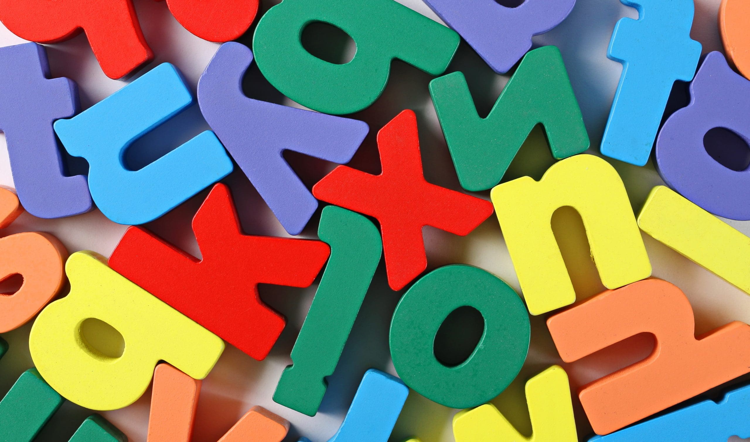
Components of typography comprise font choice, size and hierarchy, text alignment and spacing, and the effective utilization of colors. These elements collaborate harmoniously to produce visually captivating text within design. For instance, selecting an appropriate font can establish the mood and effectively communicate the intended message, while accurate alignment and spacing enhance the legibility. These typography elements can enhance the overall design and create visually appealing words.
The Importance of Typography in Visual Appeal
Typography is critical in creating visually appealing designs. It plays a significant role in conveying information and evoking emotions through fonts, sizes, and spacing. The importance of typography in visual appeal cannot be overstated, as it enhances readability and overall aesthetics.
What Makes Typography Visually Appealing?
Curious about what makes typography visually appealing? Let’s dive into fonts, sizes, hierarchy, alignment, spacing, and colors.
Choosing the Right Font
When designing visually appealing projects, selecting the appropriate font is paramount. Choosing the right font involves taking into account several factors:
- Style: It is essential to determine whether a serif, sans-serif, or decorative font complements the overall design.
- Legibility: To ensure optimal readability across various sizes and mediums, font legibility should be given priority.
- Context: When deciding, the intended message and target audience must be considered to choose a font that aligns with the brand or project.
Font Size and Hierarchy
The crucial elements to create visually appealing typography are Font Size and Hierarchy. Font Size plays a significant role in determining the prominence of different text elements, thus effectively guiding readers’ attention. Additionally, Hierarchy plays its part in organizing information by allocating appropriate sizes to headings, subheadings, and body text. For instance, establishing a clear visual hierarchy can be achieved by utilizing larger fonts for headings and smaller fonts for body text.
To craft visually appealing typography, one must consider two essential elements: Font Size and Hierarchy. The Font Size directly influences the prominence of various text elements, effectively directing the readers’ attention. In addition, the Hierarchy concept helps organize information by assigning appropriate sizes to headings, subheadings, and body text. A clear visual hierarchy can be established by using larger fonts for headings and smaller fonts for body text.
Text Alignment and Spacing
Typography, text alignment, and spacing are vital for visually appealing designs. The proper alignment ensures the text is organized and easy to read, while spacing enhances readability by allowing enough breathing room between letters, words, and lines. For instance, using justified alignment can produce a clean and formal appearance, whereas left-aligned text is commonly employed for readability purposes. In terms of spacing, adjusting the letter and line spacing can significantly impact legibility. Striking the right balance between alignment and spacing is crucial for achieving aesthetically pleasing typography.
Effective Use of Colors
When it comes to typography, effective use of colors plays a crucial role in creating visually appealing designs. Here are some tips for effectively using colors:
- Choose a color palette that complements the overall design and reflects the mood or message of the content.
- Use contrasting colors for the text and background to ensure readability.
- Consider color psychology and how different colors evoke different emotions or associations.
- Utilize color hierarchy to guide the viewer’s attention and emphasize important elements.
- Experiment with color variations, such as gradients or overlays, to add depth and visual interest.
The Impact of Typography on Readability
When it comes to the impact of typography on readability, there are various factors at play. From the distinction between legibility and readability to the art of choosing fonts for different purposes, understanding how typography can enhance the reading experience is crucial.
Legibility vs. Readability
Legibility versus Readability refers to the clarity and ease with which individual letters can be distinguished. On the other hand, readability is the ease with which paragraphs and blocks of text can be read and understood. Achieving both legibility and readability in typography is essential for effective communication. To enhance legibility and readability, using legible fonts, proper spacing, and adequate contrast is suggested. When selecting fonts and formatting, it is important to consider the target audience and purpose of the text. Experimenting with different typography styles can help find the perfect balance between legibility and readability.
Selecting Fonts for Different Purposes
- Choose a font that reflects the personality and values of the brand, such as a sleek and modern font for a tech company or a classic and elegant font for a luxury brand.
- Opt for clear and legible fonts for body text, ensuring the letters are well-spaced and easily distinguishable.
- Use decorative or bold fonts for headings and titles to draw attention and create visual interest.
- Select fonts appropriate for the intended medium, considering factors such as screen readability for digital designs or print legibility for physical materials.
Enhancing Readability with Proper Formatting
The incorporation of proper formatting is crucial in typography to enhance readability. Here are some techniques that can be used to improve readability:
- One important aspect is choosing a legible font that is easy to read.
- Another technique is using appropriate font sizes and establishing a hierarchy for headings and body text.
- It is also essential to ensure proper text alignment and spacing, which results in a clean and organized look.
- One can use contrasting colors between the text and background to enhance readability further.
Typography Trends in Design
Typography trends in design have undergone a significant transformation in recent years, reshaping our perception and interaction with written content. This evolution encompasses modern typography styles that break boundaries, experimental typographic approaches that defy conventional norms, and the integration of typography into digital design.
Modern Typography Styles
- Modern Geometric Sans-Serif: Clean and minimalistic, like Montserrat.
- Modern Humanist Sans-Serif: Warm and approachable, such as Open Sans.
- Modern Slab Serif: Bold and impactful, try out Rockwell.
- Modern Script: Elegant and decorative, like Great Vibes.
- Modern Display: Unique and eye-catching, like Bebas Neue.
Experimental Typography
- Pushing the boundaries of traditional typography, experimental typography involves exploring unconventional layouts, fonts, and creative techniques.
- Designers leverage experimental typography to create visually striking and unique designs that challenge the norms and grab attention.
- Artistic expression is enabled through experimental typography, which can evoke emotions and effectively communicate complex concepts in a visually engaging manner.
Typography in Digital Design
Typography in digital design plays a fundamental and indispensable role, exerting a significant influence on content’s visual appeal and readability. Various factors, including the careful selection of fonts, appropriate size and alignment, well-balanced spacing, and effective usage of colors, all play a vital role in crafting visually pleasing and engaging typography. In contemporary digital design, there is a growing trend of exploring experimental typography and seamlessly integrating it with other design elements.