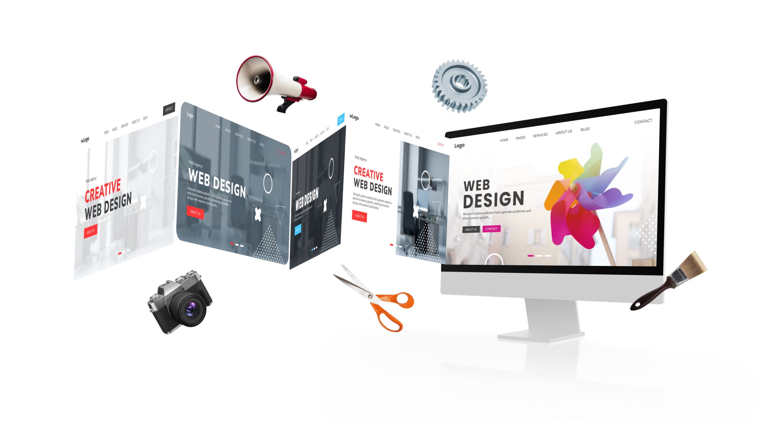
Web Design Trends That Are Overused — and What to Try Instead
Web design is constantly evolving. What felt fresh and innovative a few years ago might now feel stale—or worse, annoying to users. Some trends that once grabbed attention have been overused to the point of becoming clichés. From giant hero images to parallax scrolling, infinite feeds to the trusty hamburger menu, it’s easy to fall into a pattern that actually holds your site back.
When a Trend Stops Being Trendy
Most trends start with good intentions: to improve usability, boost aesthetics, or simplify the user experience. But over time, many of these design choices are copied and reused so often that they lose their impact. What once felt bold and new becomes background noise.
Let’s look at some of the most common offenders—and more importantly, what you can do instead.
1. Hero Images and Background Videos
We’ve all seen them: full-screen images or looping videos that dominate the top of a homepage. They look sleek and professional, but they also slow down your load time and can distract from what really matters—your content.
When done well (think Airbnb or National Geographic), they create an emotional hook. But when overused or poorly optimized, they frustrate users who just want to get to the point.
Instead, try this: Use static visuals or bold typography combined with a clear call to action. You’ll keep the impact without sacrificing speed.
2. Parallax Scrolling
Parallax once made waves with its layered, immersive experience. Scroll down and you’d see the background move slower than the foreground—cool, right? But now, it’s everywhere, and in some cases, it makes sites harder to navigate and slower to load.
Try this instead: Subtle animations and microinteractions. They bring life to your site without overwhelming the user or hijacking performance.
3. Flat Design
Flat design was a reaction to over-styled skeuomorphism. Clean lines, bright colors, and minimalism took over. But we may have overcorrected. In some cases, buttons look like plain text, and users aren’t sure what’s clickable.
Your move: Layer in some depth—shadows, gradients, motion—to guide users without cluttering the interface. Think of it as “flat-ish” design with usability in mind.
4. The Hamburger Menu
Three little lines have caused a lot of confusion. While great for saving space, especially on mobile, the hamburger menu can hide important navigation options and frustrate less tech-savvy users.
A better choice: Test a visible menu or use a combo of tabs and icons. Navigation should be intuitive, not a scavenger hunt.
5. Stock Photos
They’re easy, affordable, and… everyone uses them. But users can tell when an image feels staged or generic. Stock photography can break the connection between you and your audience.
Upgrade your visuals: Use custom illustrations, real team photos, or customer images. Your site should reflect your brand’s actual voice—not someone else’s idea of it.
6. Infinite Scrolling
Popularized by social feeds, infinite scroll can be addicting—but it’s also disorienting. It’s hard to find your place, return to a previous section, or reach important footer content.
Simplify the journey: Add “load more” buttons or sectioned pagination. Give users more control over how they browse.
7. Carousels and Sliders
They look dynamic but often get ignored. Studies show most users never click past the first slide, especially when auto-play is involved.
Instead: Use a single, focused message or allow users to scroll through featured content at their own pace. One strong message often outperforms five weaker ones.
What to Use Instead: Smart, Modern Alternatives
Design doesn’t have to be loud to be effective. Here are some newer (or better-executed) trends that prioritize experience, clarity, and originality.
Bold Typography
Let the words do the work. Big, beautiful fonts can carry your brand’s message and make content instantly scannable.
Microinteractions
Tiny animations—like a heart pulsing after a “like” or a button morphing when clicked—add personality and help guide users subtly through a journey.
Minimalism
Give your users breathing room. Minimalism removes distractions and puts the focus on your content, products, and calls to action.
Custom Illustrations
Authentic, unique illustrations help differentiate your brand. They tell a story, humanize your content, and create visual consistency.
Mobile-First Design
With mobile traffic dominating, designing with smaller screens in mind first ensures your site works for everyone. It also improves SEO and page speed.
Dark Mode
Dark interfaces are easier on the eyes and offer a sleek, modern aesthetic—especially in low-light environments. They also reduce battery usage on OLED screens.
3D Elements and Typefaces
When used sparingly, 3D graphics and fonts can bring a tactile feel to your site. It makes products pop and adds depth to your layout—just don’t go overboard.
Wrapping It All Up
Design trends come and go. The key is knowing when to embrace them—and when to move on. Great web design isn’t just about being trendy. It’s about being useful, engaging, and easy to use.
So before you default to that parallax background or stock-photo hero image, ask yourself: Does this help my user? Does it support the story I’m trying to tell? Or am I just doing what everyone else is doing?
Stay curious. Keep testing. And above all, design with intention.