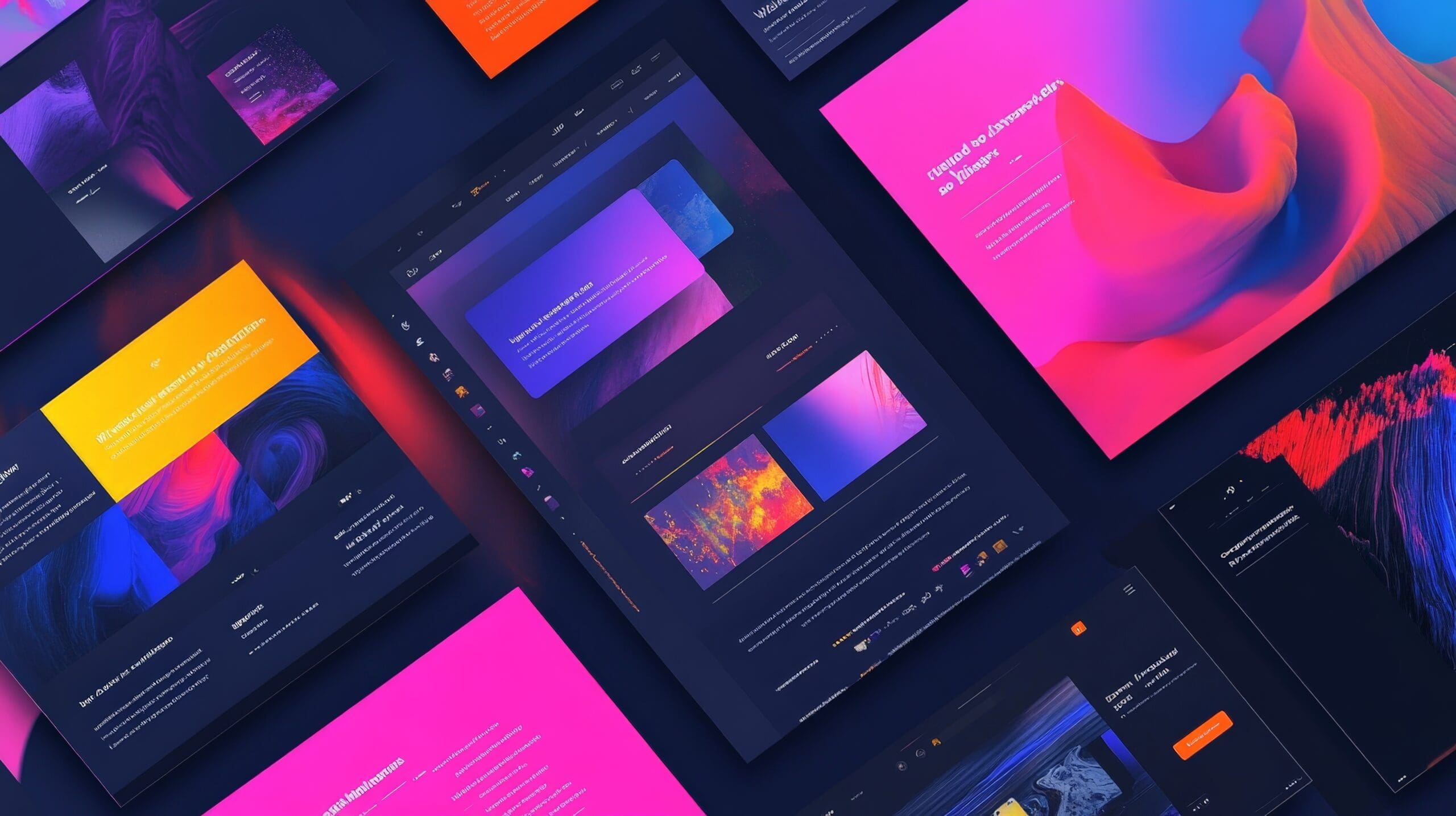
Why Certain Layout Trends Are Hurting Conversion
Modern websites often favor clean designs and flashy visuals. But when layout trends prioritize style over function, they can quietly damage what matters most—conversion.
From excessive white space to endless scrolling, some trends are slowing users down instead of guiding them forward. If your site looks modern but isn’t converting, your layout might be the problem.
Why Layout Still Matters
Your layout isn’t just about aesthetics—it’s about guiding people to take action. Good layouts reduce friction. They highlight what matters. And they help users find what they need fast.
Research shows a well-structured layout can improve conversions by up to 200%. So even small layout mistakes can lead to major revenue loss
What Are the Most Popular Layout Trends?
Here are the common layout trends dominating modern design:
- Minimalism
- Mobile-responsive design
- Heavy use of white space
- Flat design
- Large hero images and videos
- Endless scrolling
- Bold colors and oversized CTAs
These trends aim to improve usability and visual clarity. But they don’t always work in practice—especially when applied without testing or context.
When Layout Trends Backfire
Minimalism Can Hide Important Information
Minimalist designs are clean and uncluttered. But when everything is stripped down, users can’t always find what they need. A call-to-action might get lost. Navigation might feel too vague.
Examples like Dropbox and Airbnb do it well—but only because they also emphasize hierarchy, contrast, and user flow. Without those, minimalism becomes confusion.
Mobile-First Design That Breaks Desktop UX
More than 50% of traffic is mobile, so responsive design is essential. But some layouts prioritize mobile at the expense of desktop usability.
Overly stacked layouts, hidden menus, and awkward spacing on large screens can frustrate desktop users—and desktop often still drives conversions.
Too Much White Space Slows Momentum
Whitespace can make content feel breathable—but too much of it can interrupt flow. Users may scroll past key information without even seeing it.
Spacing should guide the eye—not force the user to work harder to stay focused.
Flat Design Kills Visual Cues
Flat design removes gradients, shadows, and 3D elements in favor of simplicity. But in doing so, it also removes affordance—users can’t always tell what’s clickable.
Modern flat design needs to strike a balance. Use contrast, hover effects, and hierarchy to guide behavior.
Large Visuals That Don’t Convert
Hero images and autoplay videos can look impressive. But they often load slowly or push content too far down the page.
Use visuals only when they serve a purpose: to support the message, not distract from it.
Scrolling Replaces Clicking—But Then What?
Endless scrolling works well for social feeds, but not every website is Facebook. Without clear sections or navigation points, users lose orientation. They keep scrolling… and then leave.
If you rely on scroll, break it up with CTAs, anchors, and sticky navigation.
Bold Colors Can Help—or Hurt
Bright hero sections or CTA buttons can grab attention. But overusing high-contrast colors can feel aggressive. And without consistent branding, it can erode trust.
Use bold colors with intention. Tie them to specific actions or emotional triggers—don’t just follow a trend.
What Are the Alternatives?
Sometimes, going back to basics works better.
Add More Content—When It Makes Sense
Minimalism isn’t right for every business. In industries like healthcare or finance, users expect detailed information. Text-heavy layouts with clear sections often perform better here.
Use Traditional Navigation
Users know how dropdown menus work. They know what “About” or “Contact” means. Novel navigation systems may look sleek but often confuse users.
Don’t reinvent what already works—especially for core pathways.
Increase Clickable Elements
Clickable buttons guide users forward. But many modern layouts hide them or make them too subtle.
Make buttons big, clear, and consistent. Test placements and colors to see what converts best.
Rethink Color Schemes
Different audiences respond to different colors. Blue builds trust. Red signals urgency. Green suggests health or sustainability.
Instead of defaulting to trendy palettes, align your colors with your audience and message.
Add Interactive Elements Carefully
Quizzes, sliders, and surveys can improve engagement. But only if they add value.
Use interactivity to personalize the experience—not to show off design flair.
How to Know What Works for Your Website
Don’t guess. Test.
Use A/B testing to compare layouts. Use heatmaps to see where users are clicking. Use session recordings to understand drop-offs.
Collect real feedback through surveys or usability tests. Combine that data with behavioral analytics to make smart layout decisions.
Tips for Improving Conversion Through Layout
- Keep it simple
- Prioritize calls to action
- Design for both mobile and desktop
- Use layout to tell a story
- Test everything
Final Thought
Trends change fast. But user needs stay consistent: clarity, ease, trust.
Before following a layout trend, ask: does this help users move forward—or just make the page look modern?
Design is more than appearance. It’s structure, flow, and purpose. And when it’s done right, it converts.